


The Way 2022 UX/UI Trends Will Change the Business
by Abdul Aziz Mondal Technology Published on: 27 April 2022 Last Updated on: 09 November 2022

There are many interesting trends in UX/UI. Some of them, as always, will probably fade and go away in the months to come. Some will not only stay for a while but also impact your business. That’s why you need to hire a UI designer to get the best for your company. Your team’s mindset and the way your digital product looks and feels like.
Because there’s a myriad of trends, let’s break them into four distinctive categories:
- minimalism as a navigational tool
- the use of color-changing gradients
- simplified overall UX/UI
- the impact regulations have on UX/UI.
It will help us structure the issue.
Top UX/UI trends worth following
The interesting part is that on some level they all work and complement each other, making your software development process easier. And the product itself is more thought-out, we might add.
1. Minimalism as a navigational tool
Minimalism in modern design can be a brand statement as well as an important part of product design itself.
It helps users figure out how to reach a needed functionality as well as minimize the risk of noise generation. Too much information is never good. Especially on the go, when people just want to get things done, not to figure out how to do anything.
Minimalism serves several purposes:
- it clears the overall look of the app
- it lets you highlight content
- it brings people to the CTA and other important elements of the product
- it simplifies messaging and helps users navigate the app
To achieve all of that, you need to focus on a few important things.
White or negative space: The whole purpose behind the idea is to create some breathing room so that your content can shine.
If you steer elements on your app the right way, you can figure out what goes where but most importantly – what’s crucial. White space (sometimes also called negative space) enables greater focus and puts more emphasis on what you want to say and how.
Color: When we think of „minimalistic colors” we often believe black, white, or grey will do the job. In reality, it means something else. You can totally use very vivid colors like red, orange, or yellow. The trick is to use them only when necessary and in a limited capacity. The smaller the variety of colors, the better.
Typography: Here is where it gets interesting. Some designers use experimental typography to make use of minimalistic design or simply to put their creative side to work. Testing the boundaries sounds nice but the real value comes from choosing the right font for the right type of minimalistic design.
To serve as a navigational tool, minimalism should take instead of giving. Less is more. Makes sense if you think about it. The fewer elements on the website, the more vivid and sharp they are, the clearer message they display, the better.
2. Increased use of color-changing gradients
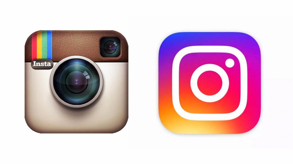
This has been happening since the fall of 3D logos. Do you remember what the old Instagram logo looked like? The difference is more than noticeable right away.
With the massive shift towards gradients, designers were able to not only refresh outdated logos but also simplify brand messaging. Now gradients are virtually everywhere.
Similar to Material Design and Flat Design 2.0, color gradients offer more depth and texture. At the same time, the app doesn’t feel overbearing to the user. Gradients can be used to both focus the user’s attention and to create an unmissable experience. It all depends on what is important to the brand at hand.
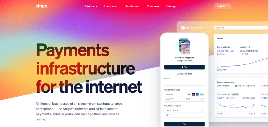
»A good example of shouting design would be Stripe:
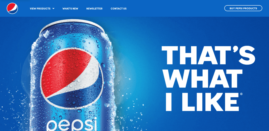
»The focused design would be Pepsi:
Blending together two or more colors or shades provides designers with more creative freedom. Aside from looking good, gradients provide the opportunity for an element to stand out from the rest of the design. It immensely helps in hierarchy development.
3. Simplified UX/UI removes complexities and unnecessary messaging
It’s especially important in industries like FinTech where numbers and dependencies between them should be clearly visible. It’s a good example to prove the point, so let’s dive in a little deeper.
The first thing the user notices is the account creation process and then onboarding. Breaking them both down into smaller pieces makes the process easier and more digestible for the average Joe. It provides breathing room for answering questions.
A lot of them are very private. Who would want to give away health or financial status info? For lending or insurance applications, this is bread and butter. Design should follow the need to make the process comfortable.
And there’s emotional design. When it comes to earning, spending, and managing money, people tend to have and display emotions. Design should reflect that. Many applications show “victory laps” when money lands on an account or when a saving target has been accomplished. They display a round of energizing messages that boosts the user’s spirit.
By removing complex messaging, simplified products engage users. They change how they react to a product. Give a user a reason to stay within the app, and discover new features. Simply do more with what is given.
4. Regulatory impact on UX/UI
Can something so elusive to most designers as regulatory laws and compliance impact the product? Unfortunately, yes.
Let’s take Web Content Accessibility Guidelines 2.0 or 2.1, for example. For the content to be considered accessible, it must be broken down into four principles. The content must be:
- It means that the app needs to have content that the eye can see, simple as that.
- The user must be able to control UI elements (click on a button, hide an element, etc.).
- The content must be clear to users.
- The content must be developed with well-adopted standards to be displayed across various devices, now and in the foreseeable future.
How to achieve compliance in this case?
You can, for example, make sure that the contrast ratio between the text and the background is at least 4.5:1 for standard text and 3:1 for larger text. You can also assure that, in the case of a web app, everything is accessible by keyboard. There are medical conditions preventing users from using the mouse.
If you want to know more, visit this web page on WCAG.
All Roads Lead to Rome
Or in this case – innovation. The trends mentioned above already shape not only products but companies as well. Creating a good app is only half the success. The rest comes in the form of user feedback and engagement. Highlighted trends will help you make the product better and ultimately serve the customer even more.
In the end, this is what it is all about. UI/UX design took the rightful seat at the table a long time ago. Now it’s time for natural evolution.
Read Also:


Related