


Increase Engagement In Your Reporting Presentations With These Tips
by Abdul Aziz Mondal Business Ideas Published on: 14 December 2021 Last Updated on: 03 February 2025

Whether the goal is to make a new business pitch, meet with an angel investor or host a webinar, a presentation plays an imperative role and is a true differentiator! However, as important as presentations are, often presenters treat them as an afterthought, then settle for mediocre slides and hence, fail to engage stakeholders & end up missing out on prospects.
From creating engaging content, self-explanatory visuals to the exquisite background and rich typography, creating a reporting presentation has many steps. Today, we will talk about out-of-the-box tips that can help you build an ideal data-driven presentation that, in turn, can cast a lasting impression on your audience.
1. Storyline The Presentation:

As a presenter, you may come up with valuable content, never seen before infographics or professional animations, but nothing engages your audience like a compelling story! Passed down through generations, storytelling is a vital part of almost every human-like narrative structure. Storytelling in a presentation brings aboard a plethora of benefits.
Not only does effective storytelling grab the attention of your audience like anything, but it also helps them foster an imagination, evoke emotions, generate empathy, build anticipation, and hence, makes your presentation a memorable & immersive experience. One should note that a persuasive presentation can draw a line between a closed deal and a missed opportunity!
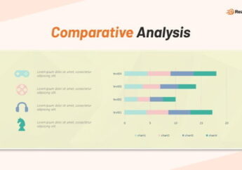
2. Leverage Data Visualization:
According to a study by MIT, it was found that humans can process visuals over 60,000 times faster than ordinary text. Enriching reporting presentations with unique data visualizations can get you almost instant audience attention. Data visualization can help you provide clarity on the subject matter while aiding the audience in identifying trends, correlating different entities & relationships, and overall comprehension.
Popular visualizations such as infographics, heatmaps, fever charts, histograms, and Harvey balls can help you put together larger sets of information into engaging and digestible pieces of information. Hence, it becomes easier for presenters to bring together unorganized information and transform it such that the stakeholders can understand the information better, derive conclusions and make faster decisions.
3. Use Text Sparingly:
One of the many reasons why presentations fail to entice the audience is because they feature a ton of unnecessary and boring text. Not only overwhelming the slides with text is detrimental to a presentation’s experience, but it may also put off the audience and lead to the phenomenon “Death by PowerPoint”!
In today’s data-driven age where people have access to unimaginable scores of information, making them dart between one slide and another may shatter your presentation goals like anything! Hence, when it comes to presentation engagement, the less has become more. Stick to succinct content pieces aided by well-thought and enchanting visuals.
4. Reinforce Key Data Points:

Often audiences struggle when it comes to retaining data-heavy presentations. Even if the slides are presented most effectively, the audience can remember only a fraction of the information. Well, you can always help your audience retain key points by using the art of reinforcement!
Presenters can leverage good-quality visuals that not only reinforce important points of the presentation but also cultivate a positive impact and elevate your presentation’s credibility. When data is reinforced clearly and pointedly, it can boost audience engagement, help all the stakeholders and build trustworthiness.
5. Follow 10 20 30 Rule of Presentation:
The 10 20 30 is one of the most popular rules concerning presentations. It allows presenters to gain absolute control over the presentation and cut right to the heart of the subject matter while ensuring engagement and perfect content delivery. The rule simply encourages presenters to have no more than 10 slides in total in their presentation.
Further, the rule states that a presentation should not last more than 20 minutes. Lastly, all slides must encapsulate a font greater than 30 points. The 10 20 30 rule assists presenters by not allowing them to overstate the content, stretch a presentation too long, or restrict the audience comprehension. Hence, not only can you keep your slides short, but also meaningful and captivating right from beginning to end.
The End Line:
In a world where millions of presentations are created every day, using standard graphics and clipart may label your presentation a visual cliche! The audience can digest and retain key points if your slides are easy on their eyes.
What sets successful reporting presentations apart from the rest is the fact that they always keep the audience at the center and leverage human psychology to its best, either by what they see or hear! The key takeaway is not to consider presentations an afterthought and pay attention to content and design equally!
Read Also:


Related