6 Amazing Tips to Improve Mobile Commerce UX
by Mashum Mollah Small Business Published on: 31 July 2018 Last Updated on: 25 September 2024
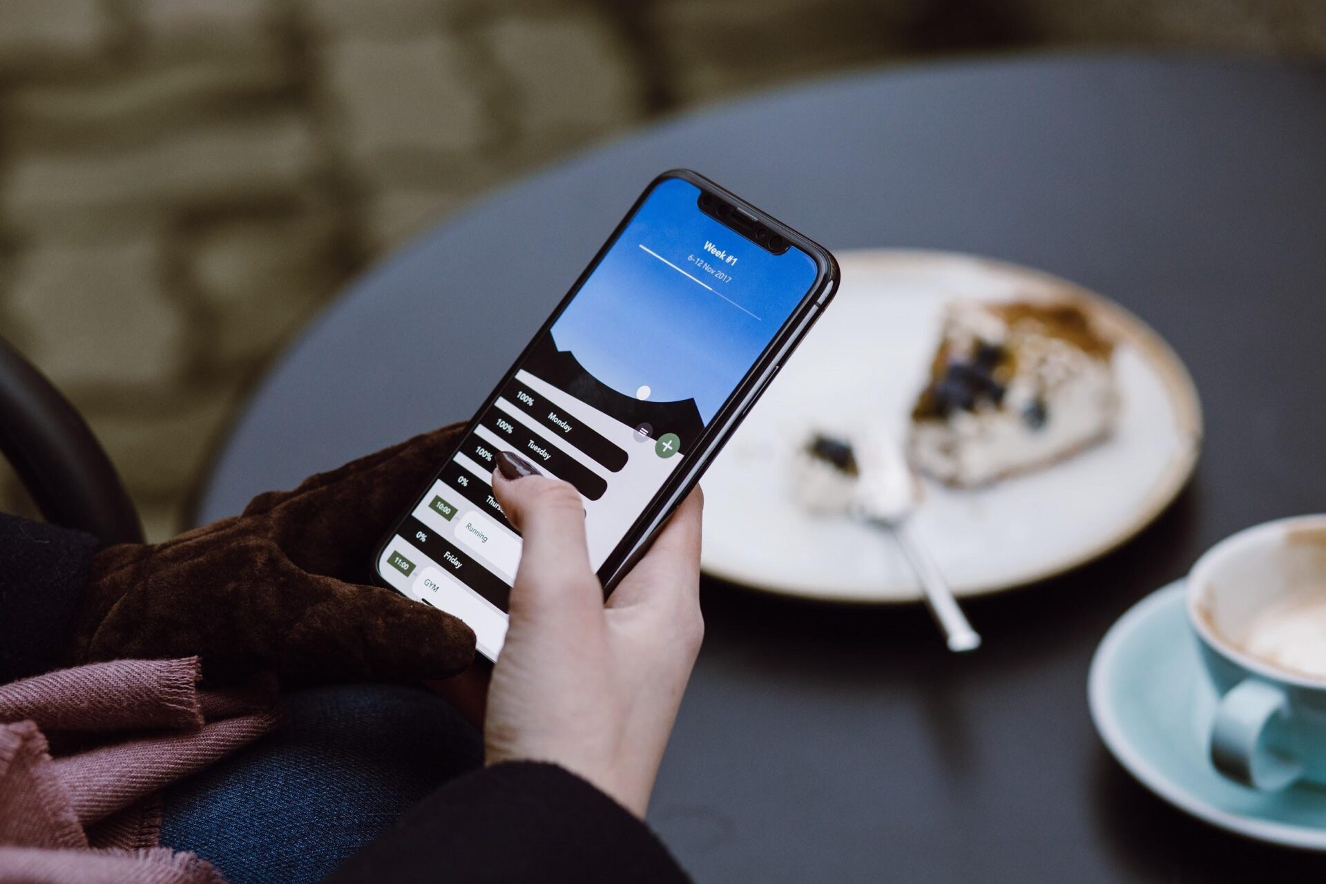
Over the last couple of years, mobile commerce has revolutionized the way goods and services industry. Transactions are more convenient and happen with just a single click.
However, running a website isn’t enough.
By 2019, 63.4 percent of users worldwide will be using their mobile phones when accessing the internet (source).
Therefore, having a mobile-responsive website is crucial for you to reach a broader customer base.
It boosts your brand perception, as well as help customers to make purchasing decisions.
So, whether you want to transition digitally, or you’re fully embracing the concept of optimizing a user’s mobile experience, here are the top tips to maximize user experience (UX):
1. Easy to use + Easy to access = More traffic & More sales :
When it comes to overall mobile experience, functionality is crucial.
Mobile commerce UX is more than just making your website aesthetically pleasing when users are using their smartphones and tablets. It’s about creating a design with the user in mind:
Optimal accessibility and usability, try a minimalist approach.
Simplify the navigation, making it intuitive.
Minimize embellishments, flash animations and videos that take time to load and slows your site down.
These little details will set you apart. In today’s generation of mobile users, people want to get things done as efficiently and quickly as possible. Therefore, your goal is to give them what they want.
You have to give your audience a fantastic user experience that has the power to engage and captivate your audience. To keep your website SEO optimized, investing in a Top SEO Agency in Toronto helps to drive in more leads and improve overall conversion.
2. Everybody loves great information architecture :
Your Information Architecture, also known as IA, has the power to make or break your sales.
Put yourself in the customer’s mindset ‒ if they can’t find the product or service they’re looking for, they’ll move on with your competitors.
Therefore, you must have to have a solid understanding of your customer’s behavior. Once you know their usual buying patterns, design your site or mobile app with a data hierarchy in mind.
Having a good IA guarantees that you’ll be gaining a significant amount of traffic and attracting potential customers.
3. An image is worth a thousand sales :
As screens become smaller and smaller, try to avoid a large chunk of texts.
The better way to do it is to utilize high-quality images that not only showcase your products and services but speaks volumes about your brand image as well.
Try considering the following:
Every product should have high-quality images.
Having a zoom option with 360 views, and compelling visuals.
4. Show your product pages some love :
Just like with the pricing, appearance and product placement on your physical store, your site’s product pages should be neat and well-constructed.
Here’s the hard truth ‒ no one wants to buy from a page that hard to navigate, cluttered, and unorganized.
Complement your product photos with clean designs that are easily navigable. Also, try considering tab navigation where you can limit your text visibility and providing users with more categorized options.
5. To get more action, step up your CTA :
You need to have a compelling call to action (CTA), for customers to see and click on.
Here are some of the most potent ways on how to make an effective CTA:
Make it massive- As a general rule, the bigger, the better. Customers should see it easily. Your CTA is a can’t miss the feature of your platform.
It should be it enticing- If there isn’t much space to make your CTA visible, you need to think of another way to make it stand out. You can do so by utilizing enticing colors, and create a good color contrast.
Placement is essential- Be strategic in how your position your CTA. Make it easy to find ‒ an average human eye tends to focus on centers and corners. Utilize this to your advantage.
Keep it simple- Make the wording of your CTA short and sweet. These days, as attention spans become shorter, you’d be surprised that even a simple “Buy now” can already do wonders.
Provide impeccable customer service– When there are problems that come up on your site, customers want it resolved right away. For example, an issue may happen during the check-out process. If people can talk to a representative immediately, then it’s more likely that they will go through with the purchase.
6. Make the payment process a breeze :
So you did it. You attracted potential customers through their mobile devices.
However, you’re just half-way through.
Even if they like your product, customers can leave your site if they don’t have a smooth payment experience.
That’s why it’s crucial to incorporate seamless payment transactions for your customers. You can try faster payment options such as Paypal, Apple and Google Wallet which requires a hassle-free transaction in just a single click.
Digital wallets are getting more and more popular in the mobile commerce world because it guarantees security for your customers, making it effortless for them to input their credit cards and other details on their smartphones.
In Summary :
A good design should is user-centric. Keeping these tips in mind, and equipping yourself with the right tools and insights means you’ll likely be set up for success. Now, it’s time to start selling!


